
How we did an AI screen audit of longbook
We had Claude review all 92 screens of longbook the way a design lead at Apple would. It gave back 339 comments, in a doc where each screenshot sits beside its comments. This is the exact process, so you can run it on your own product.
Feeling lazy to read? Ask your AI to summarise.
Read https://longbook.app/blog/how-we-did-ai-screen-audit-of-longbook.md and summarise it for me in 5 bullet points.longbook is a money app for iPhone and Mac. We built most of it with AI. It works. But when we looked at it with fresh eyes, it read like an AI wrote it.
One screen said "Only the fields you change are written." Another called the dashboard's top card "the next-payment hero". A setup screen congratulated the user as a "responsible person" right above the line "You have added 0 commitments".
None of these is a bug. Together they make a product feel generated.
Step 1: Get every screen as a screenshot, in the order a user meets it
You need every screen, not the five you are proud of. The settings screen and the error state are where the AI-sounding copy hides.
- Number the screenshots in the order a person meets them: first run, setup, the main screen, then each tab.
01-welcome.png,02-setup-step-1.pngand so on. The numbering becomes the structure of everything after it. - Use made-up data. You will paste these into tools and maybe share them.
- Take them from your latest build. Ours were three weeks old the first time, and Claude ended up commenting on screens we had already redesigned. We rebuilt the app from main and captured them fresh: 37 Mac screens and 44 iPhone screens. The remaining 11 needed taps our capture tool couldn't do, so we kept their older versions and marked them.
If your app has no screenshot mode, take them by hand on a simulator. Set the clock to 9:41 so they look like store screenshots, and use the same data on every screen.
Step 2: Put them in Figma, organised by flow
A folder of 100 PNGs is hard to review. In Figma you see a whole flow at once, side by side, which is how you spot the same mistake repeated on six screens.
We didn't drag them in by hand. Claude works inside Figma through Figma's MCP server, so we asked it to:
- Create a new file,
longbook - iOS screens. - Upload every screenshot.
- Lay them out in numbered sections, one per flow: First run, Setup, Importing a statement, Dashboard, Commitments, Calendar, Reports, Settings. Each frame named after its screen.
- Add a "Read me" card at the top saying when the screens were captured and which ones are old.
The Mac screens went on a new page in our existing onboarding file.
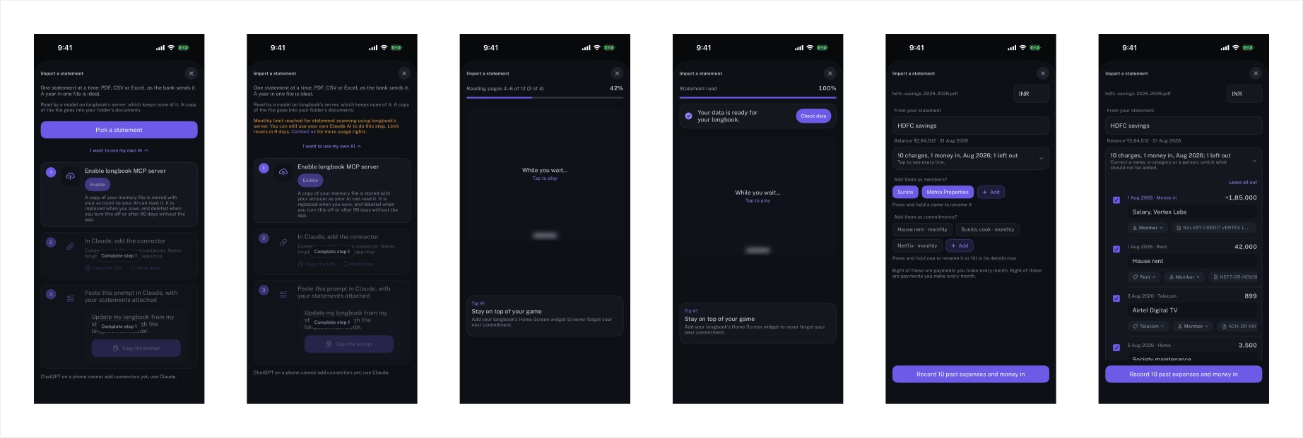
One thing to know: on Figma's Starter plan, the connector stopped us after roughly 25 calls in a session. A careless setup burns that on one frame at a time. Claude batched it instead: one call to request all the upload slots, one to place every screen and build every section. Both files, about 100 screens, took 9 calls. Reading a file back, to check the layout, goes through Figma's REST API with a personal access token, which doesn't count against that limit.
Step 3: Ask for the audit, screen by screen
This is the prompt we used, cleaned up so you can reuse it:
Go through every screenshot, one at a time. For each screen, write comments on how to make it better:
- UI and UX: layout, controls, what is unclear or hard to use.
- Text copy: make it less AI-sounding and more like product language in Apple's apps. Cut text wherever you can.
- Font sizes: the right size for each part of the screen, compared with Apple's defaults on iPhone and Mac.
Quote the exact words on screen and give the replacement. Take your time.
Two things made the comments sharper:
- Give it your design tokens. Claude read the app's typography file first, so it compared real numbers: body text is 14 pt in longbook against 17 pt in Apple's type sizes, and section labels are 10 pt tracked capitals against Apple's 13 to 15 pt sentence case. Without that it can only guess from pixels.
- Ask for the replacement, not the opinion. "This copy is too long" is useless. "'Read by a model on longbook's server, which keeps none of it. A copy of the file goes into your folder's documents.' → 'PDF, CSV or Excel, as your bank sends it.'" you can paste.
Here is what came back on real screens.
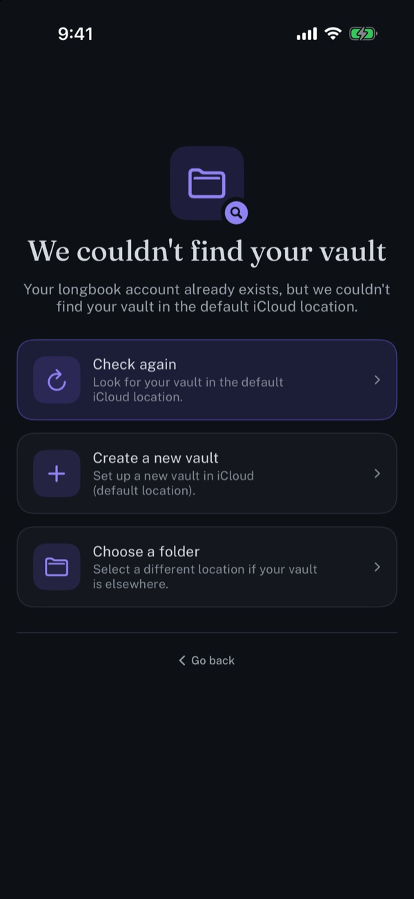
iPhone · We couldn't find your vault
Claude’s comments
- Words“Vault” appears nowhere else a person sees. Title: “Your longbook isn’t in iCloud”.
- Words“default iCloud location” is said three times on one screen. Drop every card subtitle.
- DesignThree equal cards read as a menu, and the purple first card looks already selected. Use one filled button and two plain ones.
- Design“Go back” under a rule has no clear destination. Name the place: “Sign Out”.
"Vault" is the word we use in the code. Nobody using the app sees it anywhere else.
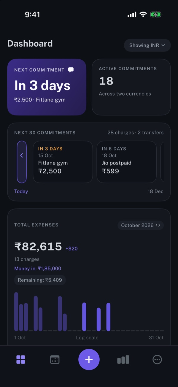
iPhone · Dashboard
Claude’s comments
- Type“Dashboard” is ~20 pt. A tab’s home screen on iPhone uses a 34 pt Large Title that shrinks on scroll.
- TypeSix tracked all-caps labels at 10 pt. Apple uses sentence-case headers at 13–15 pt: “Next payment”, “Coming up”.
- WordsLead with what people recognise: “Fitlane gym”, then “₹2,500 · in 3 days”.
- DesignThe expenses card holds five facts plus a chart labelled “Log scale”. Keep the total and one line.
The dashboard looked fine to us. The comments are about type: the screen title is 14 points smaller than an iPhone tab's title usually is, and every header is a tiny all-caps label. That is why the whole app felt dense.
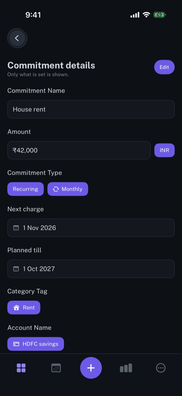
iPhone · Commitment details
Claude’s comments
- Words“Only what is set is shown.” is an implementation note. Remove it.
- DesignRead-only values are drawn as text fields, so they look editable. Use label–value rows: Amount ₹42,000, Repeats Monthly.
- Words“Commitment Name”, “Category Tag”, “Planned till” → Name, Category, Ends.
Read-only values drawn as text boxes. A person taps them expecting to edit and nothing happens.
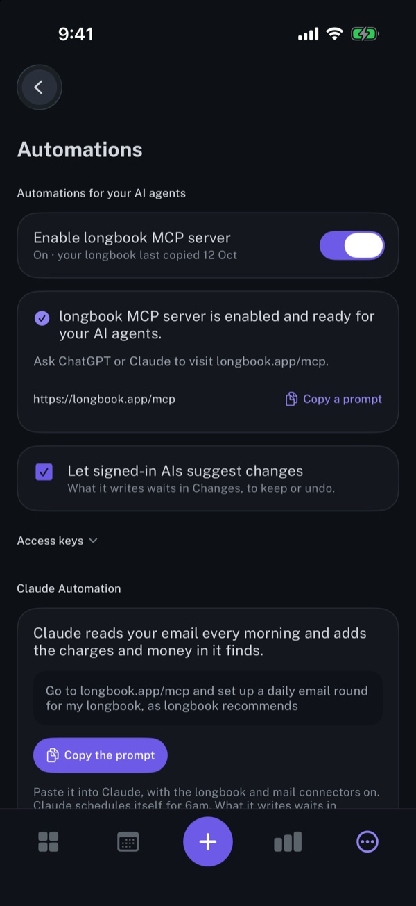
iPhone · Automations
Claude’s comments
- Words“Enable longbook MCP server”, “AI agents”, “Access keys” are developer words. → “Let AI Read My longbook”.
- DesignThe toggle and the green card under it both say “on”. Keep the toggle.
- DesignA checkbox under a switch mixes two control styles. iOS uses switches for on/off.
- Words“Copy a prompt” and “Copy the prompt” on one screen. Same action, one label: “Copy Prompt”.
This screen leaked the most developer vocabulary. "MCP server" is accurate, and it is what lets your AI read and update your longbook. Our users don't know the term, so the screen should say what it does instead.

Mac · All commitments
Claude’s comments
- DesignA phone-width column of cards in a 1280-wide window. On a Mac this is a table: Name, Next date, Category, Person, Account, Amount.
- DesignSeven filter menus run off the edge. Sortable columns plus one Filter menu replace them.
- Design“Mark paid” and “Bookmark” on every row move to the right-click menu and the toolbar.
On the Mac the problem was bigger than copy. Most screens were the iPhone layout in a narrow column in the middle of a wide window. Mac users expect tables, a list with a detail pane, toolbar buttons and a Settings window under ⌘,.
Step 4: Ask for the result as a doc you can work from
339 comments in a chat are unusable. We asked for a doc where each screenshot stays beside its comments, so we could look at both together.
Claude built it as a Claude artifact: a private web page with the screenshot on the left and the comments on the right. Each comment is tagged Words, Design or Type, with filters for each, an iPhone and Mac switch, and a checkbox per comment. When we fix something we tick it.
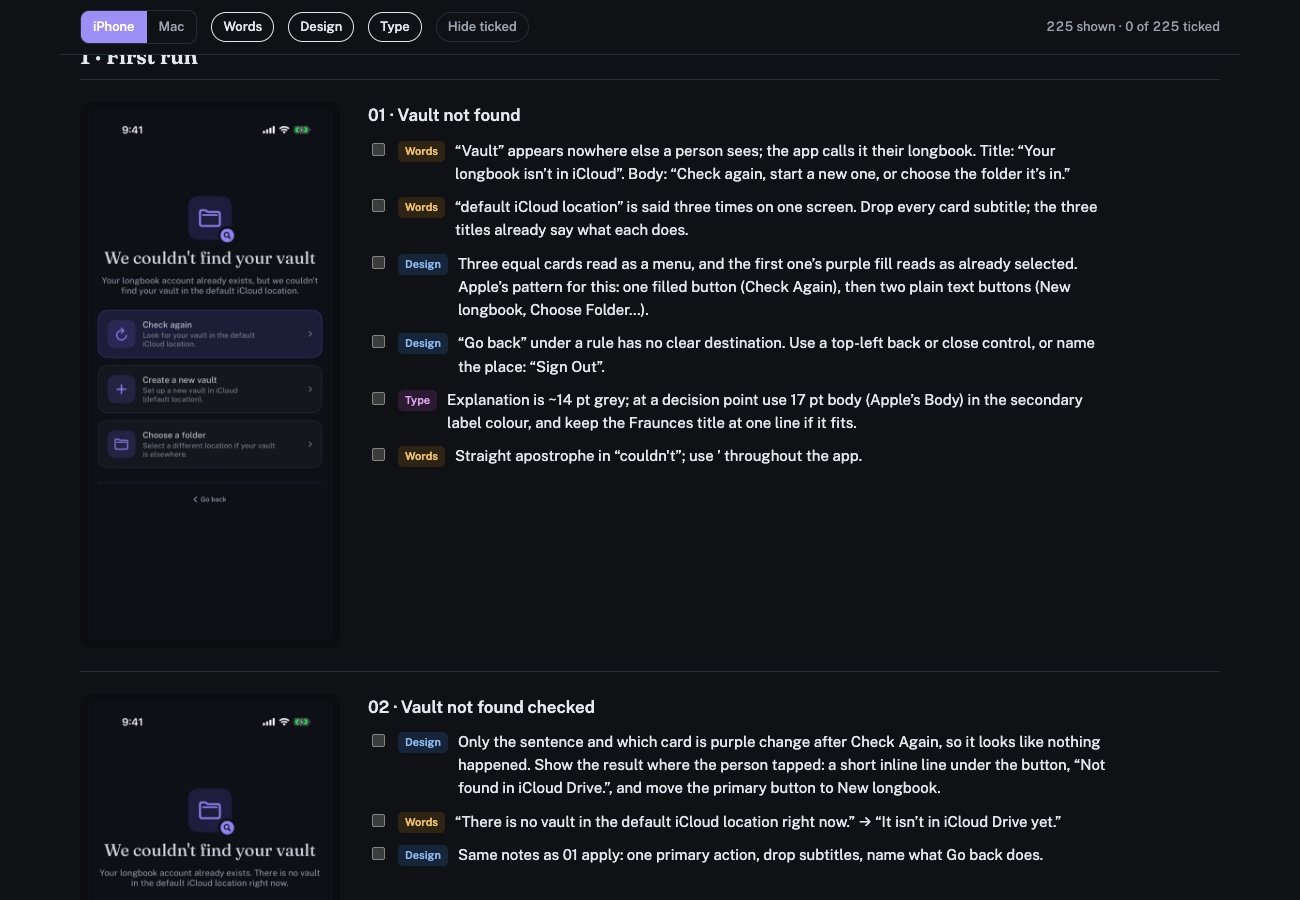
Ask for this format specifically. A long list of comments without the screenshot beside each one is a doc you won't open twice.
Step 5: Fix the patterns, not the screens
Reading 339 comments one by one is slow. Most of them are the same 10 problems repeated. Claude put a summary of these at the top of the doc, and that summary is the real output.
These are the tells that made our app sound like AI wrote it. Check yours for them:
- Sentences that explain the system. "Only the fields you change are written." "Totals are never converted or blended." The user doesn't need the mechanism. Delete them.
- Coined names for things. "The next-payment hero", "the payment-method donut", "your memory". Use the plain noun.
- Developer words on screen. Vault, MCP server, data file names, access keys, build and rulebook numbers.
- A heading sandwich. A small kicker above every title and a subtitle below it. Keep the title.
- Exclamation marks. "Let's set up your longbook!" Apple's own copy almost never uses them. Its guidance on writing is worth reading before you start.
- Buttons written as sentences. "I am ready for step 2", "Record 10 past expenses and money in". Buttons are 1 to 3 words: Continue, Add 11 Entries.
- The same thing said twice. "Nothing due" over "Nothing recurring is coming up."
And the layout patterns, which fixed most of the Design comments at once:
- A custom back button above the title, instead of the standard iPhone navigation bar with a large title.
- Tab bar icons with no labels.
- Cards holding 4 to 12 facts and 2 to 3 buttons each, where Apple apps use one-line list rows and put actions in swipes and right-click menus.
- Rows of chips for a single choice, where a menu or a segmented control is standard.
- Filter bars that run off the edge of the screen.
Fix a pattern once in your design system and 20 screens change.
What we have now is a list of 339 changes. We are ticking them off one at a time, starting with the 10 patterns.